

티스토리 뷰
💥 드롭다운
import React, { useEffect, useRef, useState } from "react"
import styled from "styled-components"
interface Props {
children: React.ReactNode
toggleButton: React.ReactNode
isOpen?: boolean
}
function Dropdown({ children, toggleButton, isOpen = false }: Props) {
const [open, setOpen] = useState(false)
const dropdownRef = useRef<HTMLDivElement>(null)
useEffect(() => {
function handleOutsideClick(event: MouseEvent) {
if (dropdownRef.current && !dropdownRef.current.contains(event.target as Node)) {
setOpen(false)
}
}
document.addEventListener("mousedown", handleOutsideClick)
return () => {
document.removeEventListener("mousedown", handleOutsideClick)
}
}, [dropdownRef])
return (
<DropdownStyle $open={open} ref={dropdownRef}>
<button className="toggle"
onClick={() => setOpen(!open)}> {toggleButton}
</button>
{open && <div className="panel">{children}</div>}
</DropdownStyle>
)
}
interface DropdownStyleProps {
$open: boolean
}
const DropdownStyle = styled.div<DropdownStyleProps>`
{ 생략 }
`
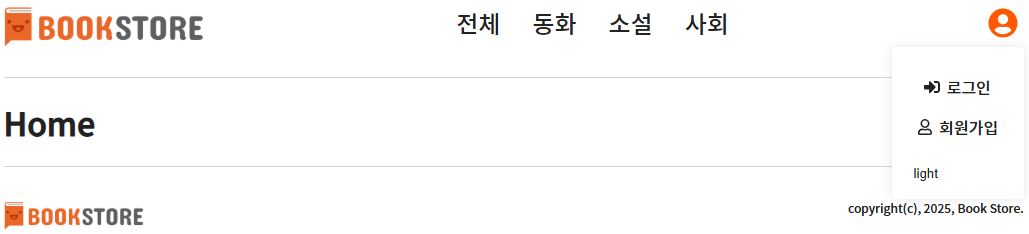
export default Dropdown원래 로그인, 회원가입은 헤더에 포함되어 있었다.
하지만 이번엔 헤더에 있는 프로필 아이콘을 클릭하면 로그인, 회원가입, 테마변경 버튼이 있는 창이 드롭다운 되게 변경했다.
isOpen 이 옵셔널이라 undefined 가 들어올 수도 있는데 boolean 이면 문제가 생기니까,
isOpen = false 으로 값이 들어오지 않으면 파라미터의 기본 값을 false 로 주었다.
그리고 handleOutsideClick 함수에서 if 문으로 dropdownRef current 가 존재하고,
dropdownRef 안에 포함된 타겟이 아니라면 setOpen 을 false 로 바꿔라. 라는 조건을 주었다.
즉, <DropdownStyle></DropdownStyle> 부분을 제외한 영역을 클릭하면, 창을 닫아라. 라는 뜻이다.
그럼 그 안에 있는 로그인, 회원가입, 테마변경은 클릭할 때, 창이 닫기지 않고 기능을 수행할 수 있지만,
그 외의 영역을 눌렀을 땐, 해당 창에 사라지게 되는 것이다.
그리고 코드에선 생략 으로 적어놨지만, svg 의 fill에 삼항식으로 open 되어있으면 주황색을, 아니라면 검정색으로 나타나게 했기 때문에, 클릭했을 땐 주황색 아이콘으로 되고, 창이 닫겨있을 땐 검은색 아이콘이 된다.
💥 탭
import React, { useState } from "react"
import styled from "styled-components"

interface TabProps {
    title: string
    children: React.ReactNode
}

function Tab({ children }: TabProps) { // 각 탭의 제목
    return (
        <>{children}</> // 각 탭의 설명
    )
}


interface TabsProps {
    children: React.ReactNode
}

function Tabs({ children }: TabsProps) {
    const [activeIndex, setActiveIndex] = useState(0)

    const tabs = React.Children.toArray(children) as React.ReactElement<TabProps>[]

    return (
        <TabsStyle>
            <div className="tab-header">
                {tabs.map((tab, index) => (
                    <button onClick={() => setActiveIndex(index)}
                        className={activeIndex === index ? "active" : ""}>
                            {tab.props.title}
                    </button>
                ))}
            </div>
            <div className="tab-content">{tabs[activeIndex]}</div>
        </TabsStyle>

    )
}

const TabsStyle = styled.div`
    { 생략 }
`

export { Tabs, Tab }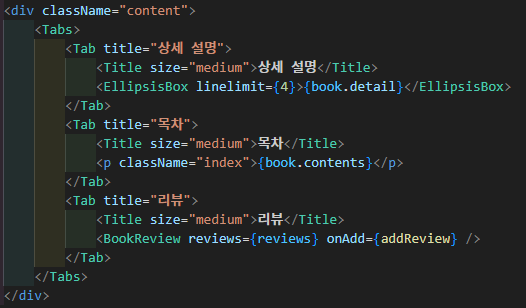
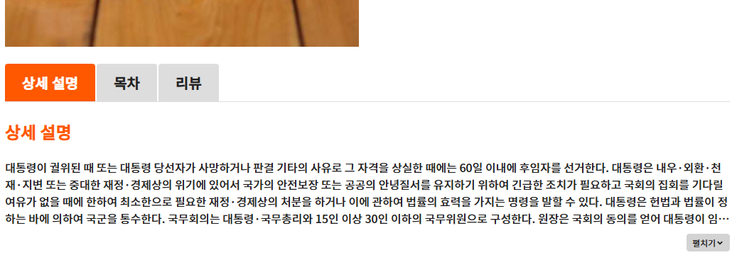
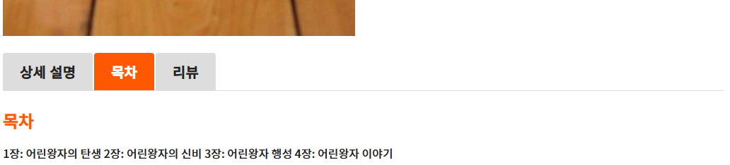
이번엔 많은 페이지에서 사용하고 있는 Tab 기능을 만들어보았다.
상세 설명, 목차, 리뷰로 나뉘어 있던 섹션들을 Tab 으로 모아서 볼 수 있게 하였다.
상세 도서 페이지에서 사용하기 위해 BookDetail 에 Tabs 와 Tab 컴포넌트를 넣어주었다.
button 을 클릭하면 클릭된 버튼에 active 클래스를 주고, active 스타일엔 주황색 배경을 넣고 글자를 하얀색으로 설정해주었다.
그럼 Tab 을 클릭할 때마다 active 클래스를 주거나 지운다.
조금 어려웠던 부분이 const tabs = React.Children.toArray(children) as React.ReactElement<TabProps>[ ]
이 부분이었는데, children 을 받아서 React.Children.toArray 메소드로 배열을 변환하는 것이다.
배열로 변환하고 그 배열을 순회하면서 props 로 title을 엑세스해서 넣을 수 있게 된다.
그래서 BookDetail 을 보면 Tab 부분에 title props 가 들어간 걸 볼 수 있다.
💥 토스트
1. Toast.tsx
import { 생략 }

export const TOAST_REMOVE_DELAY = 3000;

function Toast({ id, message, type }: ToastItem) {
    const removeToast = useToastStore((state) => state.removeToast)

    const [isFadingOut, setIsFadingOut] = useState(false)

    const handleRemoveToast = () => {
        setIsFadingOut(true)
    }

    useTimeout(() => {
        setIsFadingOut(true)
    }, TOAST_REMOVE_DELAY)

    const handleAnimationEnd = () => {
        if (isFadingOut) {
            removeToast(id)
        }
    }

    return (
        <ToastStyle className={isFadingOut ? "fade-out" : "fade-in"} onAnimationEnd={handleAnimationEnd}>
            <p>
            {type === 'info' && <FaInfoCircle />}
            {type === 'error' && <FaBan />}
            {message}
            </p>
            <button onClick={handleRemoveToast}>
                <FaPlus />
            </button>
        </ToastStyle>
    )
}

const ToastStyle = styled.div`
    { 생략 }
`

export default Toast
2. useToast.ts
import useToastStore from "@/store/toastStore"

export const useToast = () => {
    const showToast = useToastStore((state) => state.addToast)

    return { showToast }
}
3. toastStore.ts
import { create } from 'zustand'

export type ToastType = 'info' | 'error'

export interface ToastItem {
    id: number
    message: string
    type: ToastType
}

interface ToastStoreState {
    toasts: ToastItem[]
    addToast: (message: string, type?: ToastType) => void
    removeToast: (id: number) => void
}

const useToastStore = create<ToastStoreState>((set) => ({
    toasts: [],
    addToast: (message, type = "info") => {
        set((state) => ({
            toasts: [...state.toasts, { message, type, id: Date.now() }],
        }))
    },
    removeToast: (id) => {
        set((state) => ({
            toasts: state.toasts.filter((toast) => toast.id !== id),
        }))
    }
}))

export default useToastStore
4. ToastContainer.tsx
import { 생략 }

function ToastContainer() {
    const toasts = useToastStore((state) => state.toasts)

    return (
        <ToastContainerStyle>
            {toasts.map((toast) => (
                <Toast
                    key={toast.id}
                    id={toast.id}
                    message={toast.message}
                    type={toast.type}
                />
            ))}
        </ToastContainerStyle>
    )
}

const ToastContainerStyle = styled.div`
    { 생략 }
`

export default ToastContainer
5. useTimeout.ts
import { useEffect } from "react"

export const useTimeout = (callback: () => void, delay: number) => {
    useEffect(() => {
        const timer = setTimeout(callback, delay)

        return () => clearTimeout(timer)
    }, [callback, delay])
}

export default useTimeout
Toast 는 안내메세지? 같은 창을 띄워주는 것이다.
Zustand 의 create 함수를 이용해서 useToastStore 를 만들었다.
addToast 와 removeToast 라는 이름으로 Toast 를 띄우는 것과 Toast 가 지워지는 기능을 만들었다.
animation 을 이용해서 딱 딱 끊기게 뜨고 지워지는 게 아닌,
부드럽게 fade-in, fade-out 되면서 뜨고 지워지게 했다.
handleAnimtaionEnd 함수로 fade-out 이면 removeToast 를 실행하게 했다.
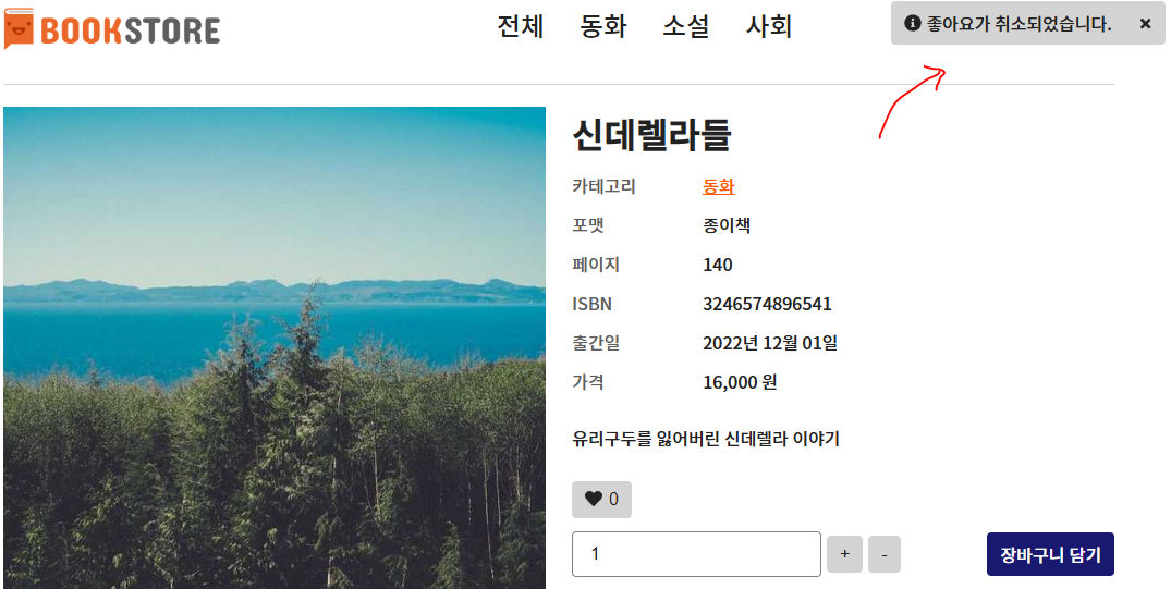
결과물의 Toast 는 info 형태인 Toast 라서 아이콘도 info 를 뜻하는 아이콘을 넣었다.
error 같이 금지, 경고인 Toast 일 땐, error 아이콘을 뜻하는 아이콘이 뜨게 된다.
button 을 클릭하면 removeToast 해라. 라는 부분도 있는데 아이콘은 plus 아이콘을 썼다.
X 라는 아이콘이 따로 없어서, plus 아이콘을 rotate 45도 해서 X 모양으로 만들어 사용했다.
역시 이 아이콘을 누르면 removeToast 되기 때문에 Toast 를 닫을 수 있다.
💥 모달
1. Modal.tsx
import { 생략 }

interface Props {
    children: React.ReactNode
    isOpen: boolean
    onClose: () => void
}

function Modal({ children, isOpen, onClose }: Props) {
    const [isFadingOut, setIsFadingOut] = useState(false)

    const modalRef = useRef<HTMLDivElement | null>(null)

    const handleClose = () => {
        setIsFadingOut(true)
    }

    const handleOverlayClick = (e: React.MouseEvent) => {
        if (modalRef.current && !modalRef.current.contains(e.target as Node)) {
            handleClose()
        }
    }

    const handleKeydown = (e: KeyboardEvent) => {
        if (e.key === "Escape") {
            handleClose()
        }
    }

    const handleAnimaionEnd = () => {
        if (isFadingOut) {
            onClose()
        }
    }

    useEffect(() => {
        if (isOpen) {
            window.addEventListener("keydown", handleKeydown)
        } else {
            window.removeEventListener("keydown", handleKeydown)
        }

        return () => {
            window.removeEventListener("keydown", handleKeydown)
        }
    }, [isOpen])

    if (!isOpen) return null

    return createPortal (
        <ModalStyle
            className={isFadingOut ? "fade-out" : "fade-in"}
            onClick={handleOverlayClick}
            onAnimationEnd={handleAnimaionEnd}
        >
            <div className="modal-body" ref={modalRef}>
                <div className="modal-contents">{children}</div>
                <button className="modal-close" onClick={handleClose}>
                    <FaPlus />
                </button>
            </div>
        </ModalStyle>,
        document.body
    )
}

const ModalStyle = styled.div`
    { 생략 }
`

export default Modal
2. BookDetail.tsx
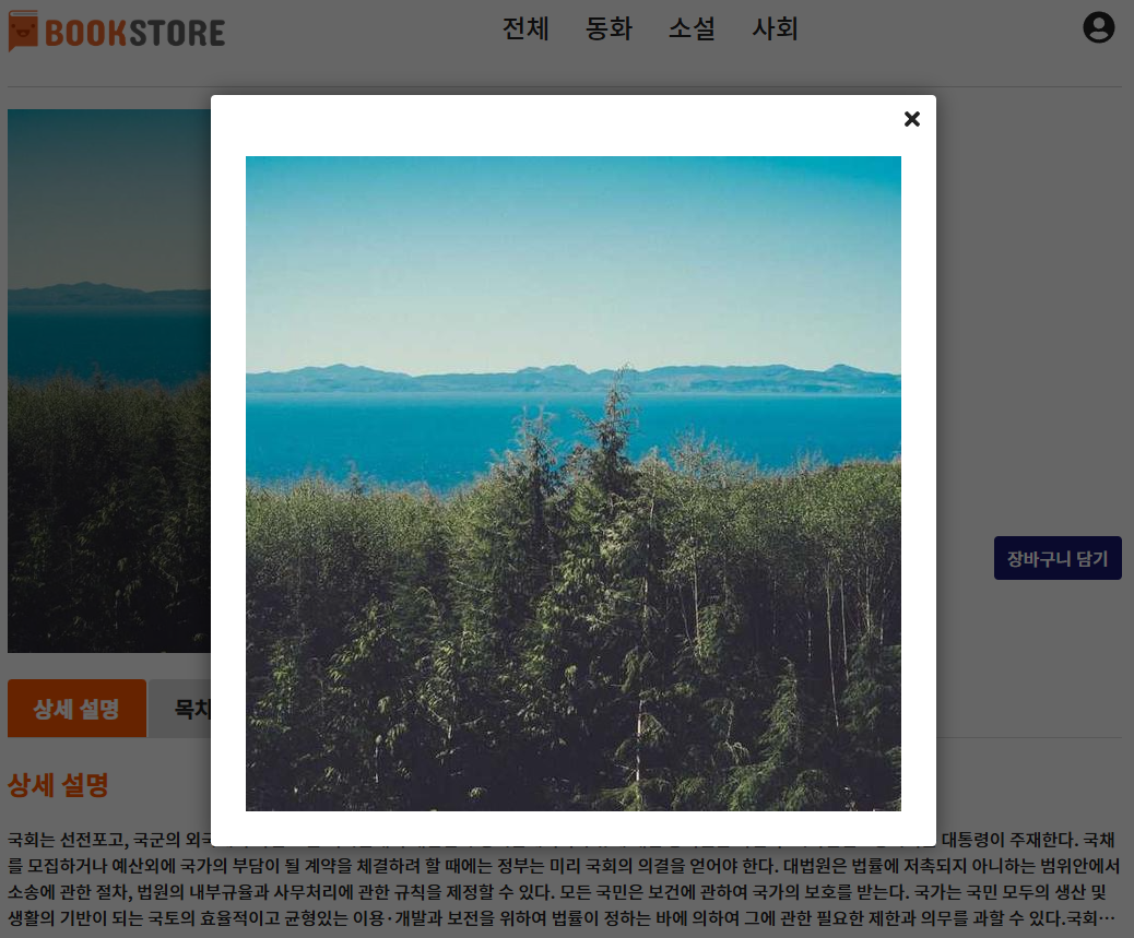
Modal 창은 보통 이미지를 클릭할 때 추가적으로 나타나는 창이다.
보통 이미지를 클릭하는 이유는 크게 보기위함인데, 그걸 위한 창이라고 생각하면 될 것 같다.
이 Modal 창도 이전 Toast 에서 사용한 코드를 많이 사용했다.
다만, 이번 강의 때 새롭게 배운 부분은 createPortal 이다.
포탈 이라는 이름만 들어도 뭔가 다른 곳으로 갈 것 같은 기분이 드는데,
말 그대로 포탈, 어딘가로 이동한다는 것이다. 이 createPortal 은 react-dom 라이브러리에서 제공한다.
createPortal 을 return 바로 뒤에 적어주고 두 번째 인자로 옮기고 싶은 곳을 적으면 된다.
보통 모달창은 다른 콘텐츠들과 같이 어울리는 것보단 따로 떨어져 있는 게 이상적이기 때문에,
body 의 맨 끝에 위치하도록 document.body 라고 적었다.
💥 무한 스크롤
1. useBooksInfinite.ts
import { useInfiniteQuery } from "react-query"
import { useLocation } from "react-router-dom"
import { fetchBooks } from "../api/books.api"
import { LIMIT } from "../constants/pagination"
import { QUERYSTRING } from "../constants/querystring"

export const useBooksInfinite = () => {
    const location = useLocation()

    const getBooks = ({ pageParam }: {pageParam: number}) => {
        const params = new URLSearchParams(location.search)
        const category_id = params.get(QUERYSTRING.CATEGORY_ID) ? Number(params.get(QUERYSTRING.CATEGORY_ID)) : undefined
        const news = params.get(QUERYSTRING.NEWS) ? true : undefined
        const currentPage = pageParam
        const limit = LIMIT

        return fetchBooks({
            category_id,
            news,
            currentPage,
            limit
        })
    }

    const { data, fetchNextPage, hasNextPage, isFetching } = useInfiniteQuery(
        ["books", location.search],
        ({ pageParam = 1 }) => getBooks({ pageParam }),
        {
            getNextPageParam: (lastPage) => {
                const isLastPage = Math.ceil(lastPage.pagination.totalCount / LIMIT) === lastPage.pagination.currentPage

                return isLastPage ? null : lastPage.pagination.currentPage + 1
            }
    })

    const books = data ? data.pages.flatMap((page) => page.books) : []
    const pagination = data ? data.pages[data.pages.length - 1].pagination : {}
    const isEmpty = books.length === 0

    return {
        books,
        pagination,
        isEmpty,
        isBooksLoading: isFetching,
        fetchNextPage,
        hasNextPage
    }
}
2. useIntersectionObserver.ts
import { useEffect, useRef } from "react"

type Callback = (entries: IntersectionObserverEntry[]) => void

interface ObserverOptions {
    root?: Element | null
    rootMargin?: string
    threshold?: number | number[]
}

export const useIntersectionObserver = (callback: Callback, options?: ObserverOptions) => {
    const targetRef = useRef(null)

    useEffect(() => {
        const observer = new IntersectionObserver(callback, options)

        if (targetRef.current) {
            observer.observe(targetRef.current)
        }

        return () => {
            if (targetRef.current) {
                observer.unobserve(targetRef.current)
            }
        }
    })

    return targetRef
}
3. Books.tsx

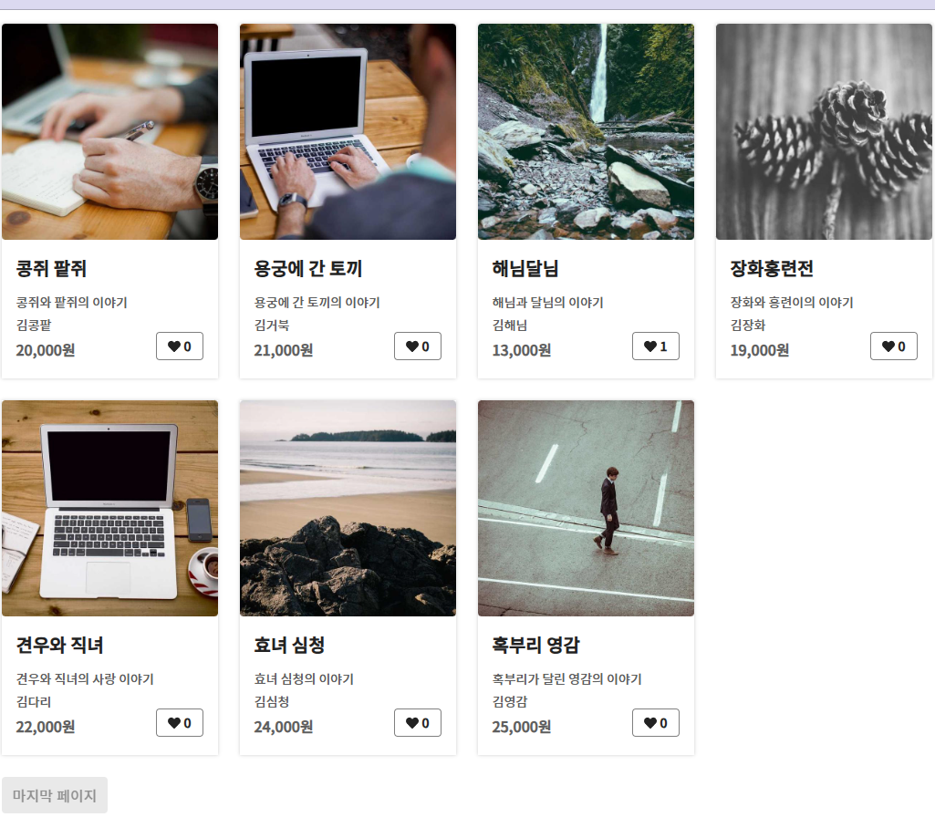
이전에는 페이지네이션을 사용하면서 8개씩 나눠서 페이지 버튼을 누르면 페이지 이동을 해서 사용했다.
이번엔 IntersectionObserver 를 사용해서 페이지네이션 및 더보기 없이도 뒤의 상품을 자동으로 나오게 하였다.
IntersectionObserver 는 스크롤을 감지해서 무한 스크롤이 가능하게 해준다.
useIntersectionObserver 를 사용해서 스크롤이 페이지의 끝에 다다르면 알아서 추가로 데이터를 로드해준다.
로드하다가 데이터가 끝나면 마지막 페이지 라는 버튼이 뜨게 해놓았다.
영상이 아닌이상 무한스크롤이 되는 결과물을 못 올리는 게 조금 아쉽긴 하지만.....
그래도 엄청 어려웠는데 어느정도 이해를 하고 넘어가서 다행인 것 같다 ㅜㅠㅠ..
'웹 개발 공부하기' 카테고리의 다른 글
| [02.14] 오픈소스 (0) | 2025.02.19 |
|---|---|
| [02.12] 메인 화면 구현하기 + 모바일 대응하기 (0) | 2025.02.18 |
| [02.11] 도서 상세 - 리뷰 (2) | 2025.02.17 |
| [02.11] 모킹 서버 (1) | 2025.02.17 |
| [02.10] Book-Shop(Front) 중간 회고 2 (0) | 2025.02.16 |